Pink Fuji vs Red Fuji: Which Hokusai Printed First
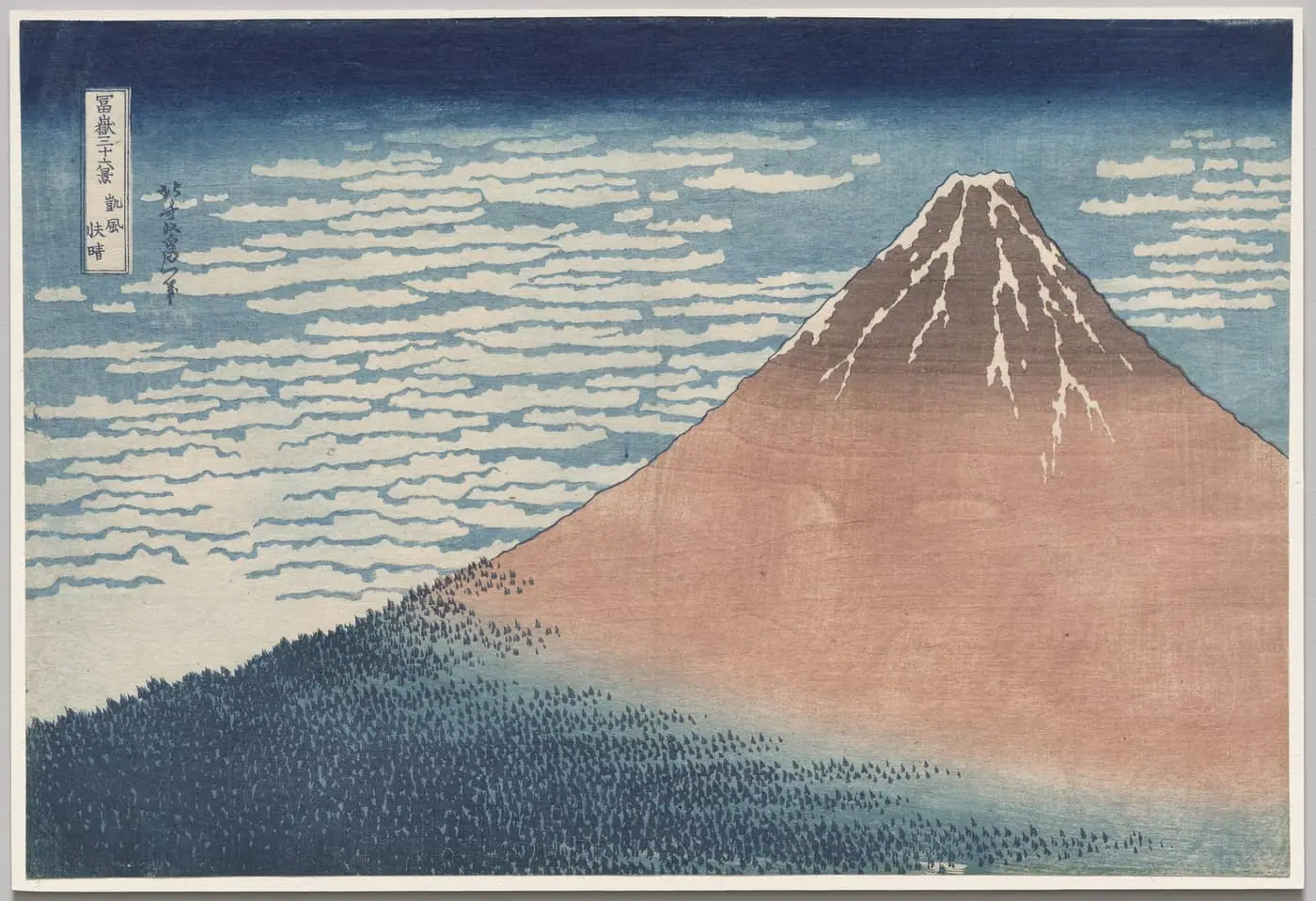
A bare cone of a mountain, deep red against a clear blue sky, a single streak of cloud across its foot: of all the images in Katsushika Hokusai's Thirty-six Views of Mount Fuji, this is the one Japan loves best. Abroad, The Great Wave takes the attention; at home, the quiet volcano wins. We call it Red Fuji, and the name sounds permanent, as if the mountain were simply red and Hokusai simply set it down.
It wasn't. The bold red we all know is not the version Hokusai made first. Before Red Fuji there was a softer, muted Pink Fuji, and the best evidence says the pink one came earlier. The famous saturated red belongs to a later, simpler run, likely cheaper to produce. Knowing that, the print stops being a fixed icon and becomes what it actually is: an object that changed across its own print life, for ordinary commercial reasons.
First, what the print actually shows
The real title is Gaifū kaisei, South Wind, Clear Sky, and it names weather, not a colour. In late summer and early autumn, when the wind comes from the south and the sky is clear, the rising sun at dawn can briefly turn Fuji's snow-bare upper slopes red. The redness is real, then, and seasonal, and brief. Be precise about the cause: it is the dawn light that reddens the peak, not the wind or the clear air, which are only the conditions that let the morning sun reach the mountain unobstructed.
That is already a stranger picture than "a red mountain." Hokusai has caught a short-lived effect of low autumn light, the kind of thing you would have to be up before sunrise, in the right season, to see. The composition strips away everything else: no foreground, no figures, just the broad cone, the streak of cloud, and the sky. It is the calm companion to The Great Wave, from the same celebrated series, and in Japan this serene Fuji is often held above the wave that made Hokusai's name in the West.
Pink Fuji vs Red Fuji: what's the difference?
Set the two impressions side by side (and most of us only ever meet the red one) and the differences stop being subtle.
The colour scheme
The version we know carries a single strong, warm red across the whole mountain. The earlier Pink Fuji is gentler and more worked: the slope is graded, green near the base shading up to brown toward the summit, instead of one flat red. The effect is softer, more atmospheric, closer to how a mountain actually reads at dawn, the cool of the lower slopes giving way to warmth above.
The pigments
The difference in look comes down to a difference in cost. The earlier Pink Fuji carried an extra, expensive ingredient: orpiment, a vivid arsenic-yellow, combined with Prussian blue and earth pigments to build the graded green-to-brown scheme, the green from Prussian blue and orpiment, the summit browner and earthier. The later runs dropped the costly orpiment and the graded scheme, leaving the simpler iron-oxide red of the bare mountain: simpler to print and better suited to mass production.
So the name Red Fuji may, in the end, commemorate a simplification: the bolder, leaner version designed for a longer print life. The expensive pigment and the painstaking graded scheme fall away; what survives, and earns the nickname, is the stronger, simpler red — the impression built to be pulled again and again.
How we know which came first
Here the evidence gets interesting, and an art historian has to be careful not to overclaim. The reordering comes from a 2019 study at the British Museum, led by the conservation scientist Capucine Korenberg, who closely compared a Red Fuji impression at the British Museum with a rare Pink Fuji impression, both pulled from the same set of woodblocks. Her conclusion, in her own measured words:
"It seems highly likely that this print, nicknamed Pink Fuji, is a first edition." — Capucine Korenberg, British Museum conservation scientist, 2019
Note the register: highly likely, not proven. That qualifier matters, and honest writing about the print should keep it. The peer-reviewed paper is more guarded still, saying Pink Fuji was printed before Red Fuji and is possibly a first edition. Connoisseurship and conservation science can build a very strong case from physical evidence, but a print made almost two centuries ago rarely hands over a certainty.
The evidence points the same way for two independent reasons. First, economics: the costlier, more refined Pink Fuji scheme is exactly the kind of thing a publisher does early (a careful, expensive first edition) then simplifies once a print proves popular and has to be churned out in volume. The refinement is "unsuited to mass production"; the simpler red is better suited to it. Second, and more concrete: examiners found greater woodblock wear in the Red Fuji than in the Pink Fuji. The Pink Fuji has sharper snow patterns and cleanly separated woodgrain "eyes"; the Red Fuji shows a broken cartouche border. Woodblocks degrade with use, each pass of the brush and baren wearing the carved lines a little further. More wear means later printing. The blocks that made the red print had simply done more work.
Two strands, economic logic and physical wear, both put pink before red.
One myth to retire while we're here
It is tempting to assume the muted Pink Fuji is just a Red Fuji that faded, a sun-bleached copy of the print we know. It is not, and the difference matters. The Pink Fuji's softer, graded colour is a deliberate, earlier scheme, chosen and printed that way with different, costlier pigments. It is not damage; it is design. Reading it as "faded red" gets the history exactly backwards: it treats the first edition as a worn-out version of the second.
(We sell the red impression, sourced from the Cleveland Museum of Art, so we cannot show you a Pink Fuji here. You can see one of the muted impressions, and read the science behind the reordering, in the British Museum's own account of the study, well worth a look beside our red one.)
The wood is in the picture
One more thing the print records, and it has nothing to do with colour. Look at the body of the mountain and you may catch a faint, organic texture across the red. That is the grain of the cherry-wood block, printed straight into the paper along with the dye. The carver's wood left its own fingerprint on every impression, the material of the tool showing through the image it made. It rewards seeing the print large and up close, where the texture of the block becomes part of the texture of the mountain.
This is a quietly radical thing to find beautiful, and it is very ukiyo-e: the print does not hide that it is a print. The grain is not a flaw to smooth away but part of what the medium is. For the longer view of that tradition, how these prints were designed, carved, and pulled by hand, and why a "picture of the floating world" was a mass medium, see our short guide to ukiyo-e.
Why the discovery changes the looking
Step back and a single idea comes into focus. We treat a famous image as one fixed thing: the Red Fuji, settled and iconic. But this print had a life. There was a refined, costly first edition, then a leaner, bolder version, probably cheaper to produce, that outlived it and became the version the whole world now pictures. The image we love is, in a real sense, the second draft, and its very name seems to belong to the leaner edition that outlasted the first.
That takes nothing from the red print. The bold version is its own achievement: simpler, stronger, more graphic, and arguably more memorable for the very reasons that likely made it cheaper to pull. The point is not that the first edition is the "true" one and the red a degraded copy. It is that knowing the order lets you see two real artistic decisions where you saw one fixed fact. Hokusai and his publisher gave the same mountain two different temperaments, and history kept the louder one.
So the next time you meet Red Fuji, you can read it twice over: as the serene, sunrise-reddened peak Hokusai composed, and as the surviving, popular edition of a print that began life softer, costlier, and pink.
See the work, with its full sourced story, on its page in the archive. It is the calm companion to Hokusai's The Great Wave off Kanagawa, made in the same series between about 1830 and 1832, and it belongs to the broader tradition explained in our guide to ukiyo-e. If you want to live with it, our printing guide covers sizes, paper and framing — and this is a print whose woodblock grain rewards going large.
Le Stampe is open. We make print-ready downloads of public-domain masterpieces — each with the story behind it. Browse the prints, or join the list for new drops. No spam, just the art.
Image: Katsushika Hokusai, Red Fuji (South Wind, Clear Sky) (Gaifū kaisei), from Thirty-six Views of Mount Fuji, c. 1831, colour woodblock print, 25.6 × 37.5 cm. The Cleveland Museum of Art, 1930.189 (Bequest of Edward L. Whittemore). Public domain (CC0).